Thursday, 25 February 2016
Day 3 and 4 of Filming
This was our last day of filming and it was a relief that we had finished all of the shots we needed!
Now there is just some editing to do, and then we are almost finished!!!These are just some short bloopers that we were unable to use in our final film trailer. Our group had just gathered around my house as that is where all our footage was. We had re-filmed the bathroom scene and so we could improve it and then we can include it in our film trailer, as before when we filmed it, it did not look as good or effective as it now does.
When filming the running shots, we had to do this a couple of times as we found that either there was someone in the shot that wasn't supposed to be or we ended up laughing due to the way she was dressed or how she was running. We just have some final editing to do overall and then our trailer is finally complete.
Photoshop for our Poster

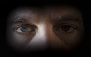
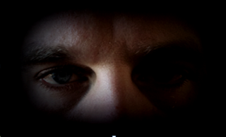
When making our poster, we spent a lot of time trying to achieve a professional look as we wanted to achieve the highest grade as possible for these pieces. Learning how Photoshop works and how to create a professional look for the poster was tricky but with research into YouTube tutorials and help from each other we quickly adapted to it. Our aim was to fade the picture into the back ground by creating a black blur around the picture. once we had found out how to blur the edge with the paint tool, we wanted to change the contrast and color of the image, this created a darker and more intense look for the cover.

This was the final image when we had changed the image. I am really pleased with the outcome, I believe it looks very professional and piercing for the audience. This allowed this photo to have a gradient effect blending out into the background giving it a professional appearance.
Thursday, 11 February 2016
Production Titles 2
Thursday, 4 February 2016
Editing our Magazine Cover
Here we are editing our magazine cover, we have found this as a bit time consuming with deciding which fonts we thought suited our magazine and would target our specific audience but it was all great fun! We decided to go for a deep red colour for our title as we found this would attract both females and males which we want for our horror trailer as well as following the conventions of a horror where this colour connotes danger. However, red is a bold colour and stands out to the audience which is essential for a poster.
Subscribe to:
Comments (Atom)

