
Showing posts with label Planning. Show all posts
Showing posts with label Planning. Show all posts
Thursday, 25 February 2016


Day 3 and 4 of Filming
This was our last day of filming and it was a relief that we had finished all of the shots we needed!
Now there is just some editing to do, and then we are almost finished!!!These are just some short bloopers that we were unable to use in our final film trailer. Our group had just gathered around my house as that is where all our footage was. We had re-filmed the bathroom scene and so we could improve it and then we can include it in our film trailer, as before when we filmed it, it did not look as good or effective as it now does.
When filming the running shots, we had to do this a couple of times as we found that either there was someone in the shot that wasn't supposed to be or we ended up laughing due to the way she was dressed or how she was running. We just have some final editing to do overall and then our trailer is finally complete.
Photoshop for our Poster
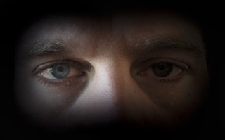
When making our poster, we spent a lot of time trying to achieve a professional look as we wanted to achieve the highest grade as possible for these pieces. Learning how Photoshop works and how to create a professional look for the poster was tricky but with research into YouTube tutorials and help from each other we quickly adapted to it. Our aim was to fade the picture into the back ground by creating a black blur around the picture. once we had found out how to blur the edge with the paint tool, we wanted to change the contrast and color of the image, this created a darker and more intense look for the cover.
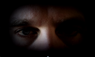
This was the final image when we had changed the image. I am really pleased with the outcome, I believe it looks very professional and piercing for the audience. This allowed this photo to have a gradient effect blending out into the background giving it a professional appearance.
Thursday, 11 February 2016
Production Titles 2
Thursday, 4 February 2016
Editing our Magazine Cover

Friday, 29 January 2016
Influences on Production

Thursday, 21 January 2016
Editing Our Poster

After having this idea we wanted to make sure that the majority of people agreed with us so we took a vote on which people were attracted to this feature; if it was placed in a DVD shop would they pick it out. We took a quick tally of 34 people aged from 16-28, through young teenagers to young adults where the horror genre appeals to the most. Out of 34 people 29 said they liked this feature and found it eye catching.
Friday, 18 December 2015
Production Titles
In our production titles, I went on adobe premier elements 10, browsed these photos from the documents and selected them to start editing. I began with a zoom as this was a common way of production titles to open in other trailer and looked effective. Then I added the transition of black and white which goes into colour. This was effective as it added a unique touch and will make our trailer look more professional. We then added the tile and with faded it in and out. Our final stage was adding in the additive dissolve, a professional way to add to the production title before cutting got the next one, making it have a seamless appearance.
For our second production title I kept the first photo large, then duplicated the same photo and shrunk it to emphasise the transition of zoom boxes. Lastly, adding text, fading in and fade out to allow similarity between the two production titles. Finally I added added alpha glow to both photos which made them appear brighter and more enhanced.
Wednesday, 16 December 2015
Opening titles
Opening titles allowed us to decide which font type we preferred to incorporate in our trailer, and we went with the Adobe Ming STD, one we researched in our practice font titles. The reason we chose this font is because it was most suitable for our horror trailer as the sinister and and mysterious look was intriguing and adheres to the conventions of a horror. We then believe this font and title can successfully engage an audience who is interested with this genre. Although our favourite opening title is the white writing against a black background, I changed the background to dark blue to give the title some texture and see what this look liked. We believe using a dark blue would still give off that eerie atmosphere but do prefer the modern day black background, white font.
Wednesday, 2 December 2015
Actor Description
Charlotte Weston:
The reason we have chosen Charlotte Weston to play our main role as the vulnerable young adult in our trailer is due to her experience in the drama industry as she has attended theatre school since she was seven years old; has achieved grade 6 in her music and drama exams. Playing lead role in Annie, Hairspray and Cats this infers that she has the confidence to be put up in front of a camera and perform a fantastic performance. This then implies that her acting will be much more advanced, overall making our trailer look more professional.
Jack Jennings:
We have chosen Jack to play our antagonist in our trailer. He attended Brit School and came out to achieve a job in lighting. He works in the drama industry, but does lighting, setting and sound for performances. Due to him being reasonably tall as he is 22 we decided that this will make our trailer look more professional as we do have an adult for our antagonist compared to a boy our age.
Sarafina:
Sarafina. who plays the role as a young girl in a middle class family, showing her life is all well and happy, before taking the turn for the worse, juxtaposing to the older actress Charlotte Weston who represents a young frightened girl who has nobody. Sarafina currently takes drama at her school as well as attending an outside drama club. She has taken part in acting in plays such as Wizards of Oz and Snow White. She is 9 years old but we found she had a lot of confidence when performing due to experience in front of audiences.
The reason we have chosen Charlotte Weston to play our main role as the vulnerable young adult in our trailer is due to her experience in the drama industry as she has attended theatre school since she was seven years old; has achieved grade 6 in her music and drama exams. Playing lead role in Annie, Hairspray and Cats this infers that she has the confidence to be put up in front of a camera and perform a fantastic performance. This then implies that her acting will be much more advanced, overall making our trailer look more professional.
Jack Jennings:
We have chosen Jack to play our antagonist in our trailer. He attended Brit School and came out to achieve a job in lighting. He works in the drama industry, but does lighting, setting and sound for performances. Due to him being reasonably tall as he is 22 we decided that this will make our trailer look more professional as we do have an adult for our antagonist compared to a boy our age.
Sarafina:
Sarafina. who plays the role as a young girl in a middle class family, showing her life is all well and happy, before taking the turn for the worse, juxtaposing to the older actress Charlotte Weston who represents a young frightened girl who has nobody. Sarafina currently takes drama at her school as well as attending an outside drama club. She has taken part in acting in plays such as Wizards of Oz and Snow White. She is 9 years old but we found she had a lot of confidence when performing due to experience in front of audiences.
Tuesday, 1 December 2015
Online Tutorials and Comments
The victim, played by Charlotte Weston will need to have a natural but feminine look as she is at home,expecting a quiet and normal night in. Therefore, I have looked at natural make up tutorials that will allow me to achieve a look most suitable for our character. The products we are mostly like to use is foundation, powder and blusher to give her that glow. We aren't too focused on the lips or eyes as again, we just want it to look natural. For her hair we would like to incorporate the plait,this could be successful as it may remind the audience of a young girl adding to her vulnerability.
For our antagonist, I found this tutorial was the most useful however we wouldn't want to copy everything as our antagonist is a male. From this tutorial I found that the effects of shadowing would be effective in our trailer as that is what the antagonist will be displayed as.Throughout our trailer the antagonist is only shown in dark and is contained as a mystery throughout to add enigmas for the audience. This has given us the idea to use dark eye shadows such a grey and black to contour the face to add shadow and depth into it.
Representation and Stereotyping in our film

In our two minute trailer we followed the representation and stereotyping in our film by following the conventions of a horror. For example, we have incorporated the character of a vulnerable girl who moves into a house that is on sale that no one has lived in for years. This is stereotypical as the audience can put themselves in the characters shoes and know that they would not move into a house that hasn't been sold for years in an abandoned street. This adds tension to the fact that we know something bad is about to happen. However, the girl is portrayed as 'stupid', a representation of young girls in horrors as she is oblivious to the danger and her surroundings. There is also an antagonist, who is displayed as a dark figure and sneaks into her house. When she hears a noise and goes upstairs this is where it shows the girl to be stupid which is a representation for girls in horror movies to be. This then frustrates the audience and puts them on the edge of their seat.The antagonist is a man, which again is a representation as men are displayed as dangerous and threatening towards younger girls, therefore this can make the audience feel even more tense. This is because men are known to be strong and dominant compared to a weak girl that us, as the audience, feel we need to protect.

Wednesday, 18 November 2015
Questionnaire
What is your gender?
Female 60%
Male 40%
Although we wanted to ask each gender equally as we believe it would be a provide balanced argument we ended up asking more females due to availability.
What is your age?
12-14 1%
15-17 58%
18 + 41%
Here we can see the main audience ranges between 15-17, this is because we wanted to make our age certificate a 15.
What do you expect to see in a horror genre?
Possession 25%
Mystery 20%
Death 55%
By asking this question we can see that audiences mostly enjoy the topic being involved around a death therefore we could interpret our movie to involve some some of tragic event.
Which film title is best for our trailer?
Elle 70%
Back again 25%
The flashback 5%
The title is important for our trailer as it is the first thing that will attract an audience. Elle was the most popular by far, as names are quite a popular title allowing us to be certain that Elle is the right title for us.
Where would you expect a horror to be set?
A rural setting e.g. forest 30%
A urban setting e.g town 35%
In a home 35%
In a home and an urban setting are the two most popular, this tells us that we could use both those settings to engage the audience.
What type of non dietetic sound do you expect to hear?
Up paced 55%
Slow 3%
High pitched 15%
Low pitched 25%
No sound 2%
Up paced, low pitch music are the two that are most popular, this gives us an idea of what non diegetic and diegetic sound we can add to really add that tension and suspense.
Would you expect an antagonist and victim in a horror?
Yes 50%
No 50%
Here we have a balanced argument between the two, which could give us more of an option to whether we are going to have one r not.
Female 60%
Male 40%
Although we wanted to ask each gender equally as we believe it would be a provide balanced argument we ended up asking more females due to availability.
What is your age?
12-14 1%
15-17 58%
18 + 41%
Here we can see the main audience ranges between 15-17, this is because we wanted to make our age certificate a 15.
What do you expect to see in a horror genre?
Possession 25%
Mystery 20%
Death 55%
By asking this question we can see that audiences mostly enjoy the topic being involved around a death therefore we could interpret our movie to involve some some of tragic event.
Which film title is best for our trailer?
Elle 70%
Back again 25%
The flashback 5%
The title is important for our trailer as it is the first thing that will attract an audience. Elle was the most popular by far, as names are quite a popular title allowing us to be certain that Elle is the right title for us.
Where would you expect a horror to be set?
A rural setting e.g. forest 30%
A urban setting e.g town 35%
In a home 35%
In a home and an urban setting are the two most popular, this tells us that we could use both those settings to engage the audience.
What type of non dietetic sound do you expect to hear?
Up paced 55%
Slow 3%
High pitched 15%
Low pitched 25%
No sound 2%
Up paced, low pitch music are the two that are most popular, this gives us an idea of what non diegetic and diegetic sound we can add to really add that tension and suspense.
Would you expect an antagonist and victim in a horror?
Yes 50%
No 50%
Here we have a balanced argument between the two, which could give us more of an option to whether we are going to have one r not.
Tuesday, 3 November 2015
Actors Interview
Friday, 16 October 2015
Film Treatment
Our opening shot begins with the father playing the piano, where we pan around the room to see the family. We then have them having a conversation around the table, which creates the atmosphere of a neutral and happy middle class family. However, as we see the mother and father angry at each other, it indicates that their life isn't as perfect as they are portrayed to be. As the little girl interrupts her mother and gets pushed away we see her run away from all her problems.
This is then represented as we juxtapose to her as a young adult, who is shown to have nobody in her life. The audience are then going to be able to get a feel of this when she is shown to go and use a phone box but has nobody to ring. We know this as she picks up the phone and puts it down again suggesting that she has not even dialed a number yet but gives up anyway. This allows her to be represented as the stereotypical vulnerable and lonely young adult that she is.
When she finds a scratch card on the floor slightly hidden, she moves into a warming home, cheap off the market. However, she does not realize that the house she gotten so cheap is haunted, in the way of an unknown killer targeting a certain group of people of the same gender.
The tension starts to increase as we are shown missing posters of young adult girls who lived in that house and the audience are aware that 'Elle' our character has moved into a haunted house targeted by a killer.
Sitting by the front door having a cigarette, her lighter flickers out, running into the kitchen to get a new one which is when a black figure walks through the door and up the stairs. Unaware of his presence, Elle begins to go upstairs. As she is about to get into the shower she hears little girls laughing. She looks out the window to find no one is there. Tension is still building up as audience are unaware of what is going to happen next.
After the shower she goes into her wardrobe wearing a robe and picks out clothing, the killer stands behind her and as she feels someones presence she turns around in shock, dropping her clothing. However, nobody is there and her and the audience feel a sigh of relief. She turns back in her wardrobe feeling stupid and paranoid. However, when she feels something brush against her leg she slowly looks down in worry and sees an arm sticking out of the wardrobe. As she screams the killer tries to grab her from behind however she pushes him off her and runs down the road. This is then incorporated with the flashback of her as a little girl running down the road fearfully. Cutting into black to the title 'Elle'. This would leave a cliff hanger to the audience wondering whether she got away and reported the killer who has been around for centuries or whether she got killed.
This is then represented as we juxtapose to her as a young adult, who is shown to have nobody in her life. The audience are then going to be able to get a feel of this when she is shown to go and use a phone box but has nobody to ring. We know this as she picks up the phone and puts it down again suggesting that she has not even dialed a number yet but gives up anyway. This allows her to be represented as the stereotypical vulnerable and lonely young adult that she is.
When she finds a scratch card on the floor slightly hidden, she moves into a warming home, cheap off the market. However, she does not realize that the house she gotten so cheap is haunted, in the way of an unknown killer targeting a certain group of people of the same gender.
The tension starts to increase as we are shown missing posters of young adult girls who lived in that house and the audience are aware that 'Elle' our character has moved into a haunted house targeted by a killer.
Sitting by the front door having a cigarette, her lighter flickers out, running into the kitchen to get a new one which is when a black figure walks through the door and up the stairs. Unaware of his presence, Elle begins to go upstairs. As she is about to get into the shower she hears little girls laughing. She looks out the window to find no one is there. Tension is still building up as audience are unaware of what is going to happen next.
After the shower she goes into her wardrobe wearing a robe and picks out clothing, the killer stands behind her and as she feels someones presence she turns around in shock, dropping her clothing. However, nobody is there and her and the audience feel a sigh of relief. She turns back in her wardrobe feeling stupid and paranoid. However, when she feels something brush against her leg she slowly looks down in worry and sees an arm sticking out of the wardrobe. As she screams the killer tries to grab her from behind however she pushes him off her and runs down the road. This is then incorporated with the flashback of her as a little girl running down the road fearfully. Cutting into black to the title 'Elle'. This would leave a cliff hanger to the audience wondering whether she got away and reported the killer who has been around for centuries or whether she got killed.


Subscribe to:
Posts (Atom)