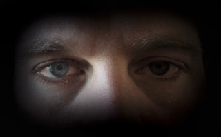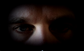
When making our poster, we spent a lot of time trying to achieve a professional look as we wanted to achieve the highest grade as possible for these pieces. Learning how Photoshop works and how to create a professional look for the poster was tricky but with research into YouTube tutorials and help from each other we quickly adapted to it. Our aim was to fade the picture into the back ground by creating a black blur around the picture. once we had found out how to blur the edge with the paint tool, we wanted to change the contrast and color of the image, this created a darker and more intense look for the cover.

This was the final image when we had changed the image. I am really pleased with the outcome, I believe it looks very professional and piercing for the audience. This allowed this photo to have a gradient effect blending out into the background giving it a professional appearance.
No comments:
Post a Comment