Thursday, 25 February 2016

Day 3 and 4 of Filming


This was our last day of filming and it was a relief that we had finished all of the shots we needed!
Now there is just some editing to do, and then we are almost finished!!!
These are just some short bloopers that we were unable to use in our final film trailer. Our group had just gathered around my house as that is where all our footage was. We had re-filmed the bathroom scene and so we could improve it and then we can include it in our film trailer, as before when we filmed it, it did not look as good or effective as it now does.

When filming the running shots, we had to do this a couple of times as we found that either there was someone in the shot that wasn't supposed to be or we ended up laughing due to the way she was dressed or how she was running. We just have some final editing to do overall and then our trailer is finally complete.

Photoshop for our Poster


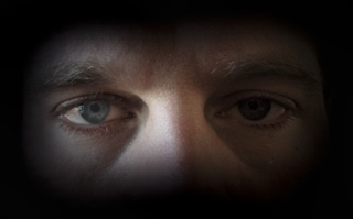
When making our poster, we spent a lot of time trying to achieve a professional look as we wanted to achieve the highest grade as possible for these pieces. Learning how Photoshop works and how to create a professional look for the poster was tricky but with research into YouTube tutorials and help from each other we quickly adapted to it. Our aim was to fade the picture into the back ground by creating a black blur around the picture. once we had found out how to blur the edge with the paint tool, we wanted to change the contrast and color of the image, this created a darker and more intense look for the cover.


This was the final image when we had changed the image. I am really pleased with the outcome, I believe it looks very professional and piercing for the audience. This allowed this photo to have a gradient effect blending out into the background giving it a professional appearance.

Thursday, 11 February 2016

Production Titles 2


Our group practiced production titles by using adobe, where we inserted the names of who is involved in the process of our trailer. These are the titles that we would use in our finished film trailer. We have put the titles in different styles to see which one looks the most effective when put into our trailer. However, as a group we decided to use the the first one as we found the font used suited our genre as it created an eerie appearance and made our trailer look more professional.

Thursday, 4 February 2016

Editing our Magazine Cover

Here we are editing our magazine cover, we have found this as a bit time consuming with deciding which fonts we thought suited our magazine and would target our specific audience but it was all great fun! We decided to go for a deep red colour for our title as we found this would attract both females and males which we want for our horror trailer as well as following the conventions of a horror where this colour connotes danger. However, red is a bold colour and stands out to the audience which is essential for a poster.

Friday, 29 January 2016

In the process of Production Titles


Influences on Production

Taken 3 is about a women who gets murdered in her ex husbands house and Liam Neeson, the main actor in the Taken movies tries to find the men who killed her. The director of the movie was Olivier Megaton and he uses fast editing to create that tension and fear which we want to give to our audiences. Also the setting in the home allows us to get an idea of what key lighting we can use in the house to create that even though this movie is an action/thriller we wanted to incorporate that thrill you get when watching movies like this. At the beginning of the film the non dietetic sound is quite eerie and mysterious, making the audience feel tense. Although everything that is happening is relaxing and calm. This is the effect we want to have at the beginning of our trailer as we think it would be successful at getting the audience on the edge of their seat.


Thursday, 21 January 2016

Editing Our Poster


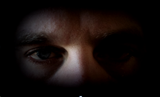
This is our group in action of editing our film poster, here we took a photo of our teacher so we would use our own original photo to achieve a higher grade, we have then zoomed into hes eyes to enhance the features to use as a selling point in our film poster. The reason we chose to do this was through research of film posters within our genre. This enabled us to realise what we think gave an effect to the audience and made those specific posters stand out.

After having this idea we wanted to make sure that the majority of people agreed with us so we took a vote on which people were attracted to this feature; if it was placed in a DVD shop would they pick it out. We took a quick tally of 34 people aged from 16-28, through young teenagers to young adults where the horror genre appeals to the most. Out of 34 people 29 said they liked this feature and found it eye catching.