Thursday 14 April 2016

Question 1a

1a) Describe how you developed your skills in the use of digital technology for media production and evaluate how these skills contributed to your creative decision making. Refer to a range of examples in your answer to show how these skills developed over time.

Digital technology still continues to drastically improve as years go on, with more to offer on pretty much everything. This is one of the reasons why we found our digital technology did improve by A2 as well as the fact we were more experienced in this area.

In AS the technology we used for making our opening two minutes was Adobe Premier Elements on PC. With this we could do a variety of editing to make our opening two minutes look more professional as we were able to trim and cut shots down which provided seamless shots. This is efficacious as it allows the audience to benefit from the good quality as if it had increasingly noticeable jump cuts this would make the audience less intrigued to watch our film as it would look low budget. Adding transitions such as additive dissolve made links with the cutting and again allowed our opening two minutes to look more advanced. We also used the fade in and out transition with the credits as it again made the opening two minutes seamless. As well as this we could add soundtracks in which we edited to fit the film helping us to create the build-up and reach the climax at the right time, creating an eerie atmosphere. When creating the titles it allowed us to follow the codes and conventions of a horror as we could choose background colour, a type of font, and the font colour. Overall, this helped adapt our film to its final product, looking experienced and polished. However, the disadvantages of using this are that we found it reasonably difficult at first so it was very time consuming and hard to get to grips with. This meant we couldn’t do as much editing as planned which could have affected our final product.

We used a Canon 1200D camera. This came to an advantage to us when filming as it had high standard quality. However, the camera was quite large and heavy therefore it was harder to transport to different locations of filming. Again, as it was our first time filming we were unaware that this would make us more tired walking to the location therefore having shorter time to film. The camera had manual focus, which allowed us to change the depth of field, blurring the background and have a sharp focus on our chosen characters and surroundings. This could have provided tension and suspense at certain points of the scene as it would enable us the focus on certain characters such as the victim, but having the antagonist in the blurred in the background with only the audience aware of his existence. With the camera we used a variety of shots such as match on action, low shots, and high shots to tell the audience who was vulnerable in our trailer, taking away the power from the young girl victim. However when doing hand held shots which we used in our opening two minutes it was much more shaky than expected due to the camera being large which made our opening two minutes look less advanced.

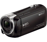
I have developed these skills at A2 by using the Sony CX 405 Handycam. This camera was lighter and therefore more efficient as the camera could be easily transported to different locations. As well as this some of the shots were quite spontaneous. For example, if we went on a day trip it was easy to take a few shots of the location to add to our trailer, for example, when we were in London. This is efficacious as it makes our trailer look high budget which would result in a wider audience watching our film. This year we used a tripod regularly in our shots to create a steady film as last year we mainly filmed using our hands which made our opening two minutes look less polished. Last year our filming was taken all outside, therefore we were dependent on the time to affect our lighting. This was not successful as we couldn’t use the lighting to create an ominous atmosphere. This was different in A2 as we filmed inside therefore we could change the lighting to affect our trailer. For example, in the eerie scenes the lighting was more dimmed; we could place lamps in certain areas in the room to put more light onto the main characters, implying to the audience which characters had the most prevalence. We researched this by watching the trailer of Taken 3 where throughout it is set in two houses and the effect of the lighting used to create suspense and tension. This year we used Premier Pro instead of adobe elements which is a much more updated and advanced version. This was a huge advantage as it has updated tools and much more high tech which ended up making our trailer look more advanced as we could incorporate new things such as transitions, more texts and fonts which would fit the conventions of our genre.


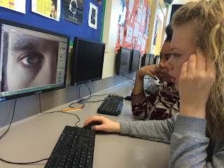
When it came to tools such as Adobe Elements and photo shop, we were already much more advanced and knew our way around the tools therefore could edit things faster as well as trying new things which made our trailer more successful. For example, we incorporated a range of soundtracks, were able to put these together and trim them in order for our trailer to create a build up as one soundtrack didn’t give the satisfaction of a climax that we were looking for. Photoshop was helpful for our poster, where we edited around a photo in order to enhance the eyes. The black but soft gradient effect meant that the poster looked professional and more eye catching which would have been an expectation. We also highlighted the eyes, by selecting the specific area and enhancing it by adding brightness and contrast allowing them to be a key feature for our poster. The eyes created mystery which relates to what our trailer is all about.

Wednesday 13 April 2016

End of our journey!

Dear Blogspot,

Over these past two years I have developed so many skills when editing an opening two minutes in AS and a trailer in A2. This part of the Media course was very creative and it brought out a side of me that I never thought I had with creating storyline's for trailers to appeal to a specific audience. I feel a strength was how my analysis developed over these past two years and how I have applied in depth information allowing me to achieve higher grades. 

Next year I am gong to University to take on Events Management and I feel like media has helped me a lot with this choice as it as allowed me to be creative and use my brain to apply out of the box ideas. I am very excited and am going to miss media very much!!

Goodbye Blogspot, 
Love From
Carly xxx

Audience and Genre

Blumler and Katz's Uses and Gratification model looks at how the media appeals to its audience's need's. Some of these needs are to inform and educate, to identify with characters, to escape from reality, for entertainment or for social interaction. As our trailer is an thriller horror genre, it is important for our audience to connect with the characters in order to empathize when they get into trouble. We made our victim, a young female in order to appeal to the target audience. This gives the audience an escape from reality as they are absorbed in the story. Additionally, we have created a great deal of suspense and fear, this creates an entertainment for the audience while also allowing them to escape from the boring everyday life. We created suspend by adding tense music and cutting the shots with the music. We also added dip to black to create an eerie atmosphere and creating a climax for the final scene when the victim gets taken. When audiences watch films such as horrors, often they want to go back to friends and the them about it and fit in tot he norms of youth culture. therefore if our film connects the audience members, they are more likely to interact with others,, sharing their opinions on the film

In our trailer we did not use Male Gaze as a key feature; this is based upon our story line being a horror of us using a vulnerable young girl. Opposed to her appealing to the male eye due to her young age and innocence, the audience instead feel the need to protect her. We felt it wasn't necessary and wouldn't affect our audience because the percentage of boys are only risen because it is a stereotypical date, where the girl and boy attend to watch a horror so the girl can cuddle up to him for protection. Therefore, even though our film may not directly appeal to males because they are more interested in action for example, we still have a general audience of viewers.This is shown by in the movie 'The Conjuring' 54% of viewers were female, followed closely by 46% of males.

What genre is the trailer and how have you conveyed this this to your audience?
Our trailer fits into the genre of horror as it conforms to the main conventions within this genre. We have conveyed this to the audience through the use of sound, building tension and setting a much more dramatic atmosphere. We have done this and so the audience can get a feel of the emotion of the characters but also and so they are aware that something is going to happen. We have also made it clear of the genre through the characters such as the antagonist who is dressed in dark clothing with a hood and has his face covered and so remains a mystery to the audience who this is and what he is doing there. This also makes it exciting for the audience as they are unaware of what is going to happen but also fits into the conventions of a horror as we are aware that the antagonist is someone that we do not wish to come across but its someone that is predominant in the horror genre. Some of the camera shots that we had used hints to the audience that the genre may fit into the horror theme such as when we have the victim walking up the stairs and the camera is panning up but focusing on her feet. Although this is effective on its own, as we have paired it with the dramatic music which creates a more tense atmosphere, it makes the audience want to carry on watching the production. 

4) How does the mise-en-scene support the genre? What is the role of the specific elements of the mise-en-scene? refer to props, costume, makeup, location, theme?
The mise-en-scene is not particularly set in the stereotypical dark forest or the haunted house as we wanted to make our idea original but still fit into the horror genre. We ended up filming in three different locations for our trailer as we felt that it was important for the audience to see the different stages of the characters and the film trailer. The first setting that we used was a family home as we wanted to express the family as a traditional happy family home. We wanted to show the family at the beginning and so the audience would understand how the characters got to where they are. this fits into the horror genre as it is effective for films and trailers to start off normally before everything starts to go wrong. The second location that we used was only a section of the stairs and the bathroom as it was something that we wanted to include but did not look as good when filmed at the 'family home'. The final location that we used in our trailer was a small studio flat that is all on one level. We used this to show the audience how the child character had grown up and the audience were able to witness this and are able to follow the characters on a journey. This fits into the genre as it makes it much more interesting for the audience to know what is going on and how the characters go from a 'good' life to one that is 'disrupted' and 'ruined'. To fit into our genre, we had the antagonist dressed in black which is typical in this genre as we don't really find our who this is until the very end.
For the costume in our trailer, at the beginning, we had the parents dressed in their everyday clothes and the child is in her school uniform and so the audience are able to see them as what they would be in their normal everyday lives. This fits into the genre as we do not want the audience to see everything go wrong from the beginning as it would take away the excitement, which also allows the audience to see the personality of the characters. Further on in the trailer when we see the youngest character grown up, she is dressed in clothes that are popular to the target audience and so a pair of jean and a coat and so they are able to relate to the characters as much as they can. This fits into the genre of horror as although it is part of their everyday lives, it tells the audience that the characters are not ready for what is going to happen as they are not expecting it. This makes it more effective for the audience to watch.

Generic expectations have been adhered to in our A2 production trailer. This is evident through our typical story line that includes the codes and conventions of young girl. By using a young girl is effective as the audience which is mainly females, are able to put themselves in the young females shoes adding to the suspense that it creates. This is effective as when we introduce the antagonist, which again is another expectation to see in a horror. the audience are immediately aware that something bad is about to happen. With the young female we enhanced her innocence by her wearing a school uniform making her look sweet; with the antagonist he was wearing all black, creating the atmosphere of danger which the colour black connotes due to it being dark, mysterious and eerie. twas effective to use a male as our antagonist because they are known to have more power and strength, insisting that the getaway for the young girl is pretty much impossible adding to the frightening atmosphere.
We also followed the generic expectations by the location. For example, we used a deserted house in a run down area. This is effective as it does create fear and anxiety among the audience. The soundtrack links in with this as we cut from normality in one scene to the young girl grown up and alone. With this the non diegetic sound comes more upbeat, ominous in order to create a build up of tension, reaching the climax of when she is officially taken.
We have also adhered to the generic expectations with the editing of our trailer. This was achieved by researching other horrors similar to us such as Taken. This enabled us to include many fades to black and fonts which can add to the eerie atmosphere. This was effective as it allowed our trailer to look more advanced which can result in an increase number of watchers.

Our production is different from others in the same genre, as we have shown the development of the young girl from a child in to a young adult. this helped the audience understand her better as they know what obstacles she has faced during her life. It also develops a better connection for the audience. Another way in which our film is different to others, is it is set in a very ordinary middle class town. this isn't necessarily conventional for an thriller horror film as usually they are set in dark gloomy villages. This makes the film seem more naturalistic and creates more fear for the audience as they can relate to the locational settings. We decided to cast a young black male actor to be our antagonist as we believe the audience would feel the story more as it relates further to their life. Also there is a large moral panic across the UK of 'Hoodies' and therefore using the stereotypical character allows the film to have a greater effect. In Travis Dixon's archetypal stereotypes, he devised the buck character that is a young black aggressive character. this stereotype is often represented in films as the antagonist. This makes our film conform the the conventions of the genre, however giving it an edge as the antagonist is very young and is often in the youth culture today.

Thursday 24 March 2016

Evaluation of all Products


In our magazine poster and our film poster, we have use the same image as the main image on both covers to show that they are advertising the same film. On the film poster, we used a long shot of the image to show the surrounding buildings around her, suggesting that she is alone which is the main story behind our trailer. We had this in black and white and so it contrasts against the image of eyes that we have positioned at the top of the poster. On the other hand we decided to do the image ion the magazine poster to be much more zoomed in and so the audience can focus on her as she is the main character throughout the film trailer. We decided to have this image in colour and fade another image of smoke over the top and so it still fits into the genre of horror but makes it aware to the audience that it is a magazine.This all links in with our film trailer as we have used the same character with the same costume on and so we can show the relevance between all three.
The name titles that we used in our film trailer were very similar to what we have used in our film poster as we think that it is important to keep the names the same to show who is in the trailer and who is involved in creating the final out come. We have presented both the names in the trailer and the poster the same as we would see them in successful media products and so the names that are not the main characters in the trailer are presented together at the end but also in the poster, the names are displayed along the bottom and so it is set out how we would see it on DVD covers. We have used the same font on both the trailer and the film poster and so we can keep it simple but effective for the audience viewing it. When creating the name and the font that we have chosen for our film name, although they are not in the same font as we found that it did not look as effective and professional on both the magazine and the trailer, we did keep the font the same for the trailer and the film as it is clear to the audience that we are advertising the same film product.

Sunday 20 March 2016

Evaluation Task 4

We used many different technologies within the research planning and evaluation stages. The camera we used was the Sony CX405 Handycam camera to film our trailer as it is has high definition image and high quality sound recording facilities. We believe it is very important to have a high quality camera because the trailer will look high budget and professional.
When we were filming we found that the camera was very good as it could adjust to some of the lighting, there are certain effects that allow us to make the images stream together seamlessly as the camera adjusts the lighting depending on the time of day. We also used a tripod with some of the shots in order to make sure the shots were steady and professional looking. Last year i did not use a tripod as much and therefore found it hard to create the high budget feel.


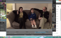
In terms of the editing format, our group used adobe premiere pro. We were given the opportunity to use the school's computers and the format of adobe premiere elements, however we found the format hard to use and didn't render the footage as fast as we wanted. The editing format that we used allowed us to become very experimental with the footage. We also used transition tools such as the fade to black etc, I allowed us to create a high budget effect for our trailer. On one of the days of editing, we prioritised the titles. We spent hours looking through the fonts and different shadowing effects for the titles. We found the software extremely effective when achieving our titles as there was a wide range of choice and styles.


Some cons of the digital technology during this process were I shot some of the opening images on an iPhone, as I found some establishing shots of the location that I wanted for my film, while walking to school one morning. This therefore meant that the image was slightly different as the cameras have different quality of footage. Another problem we occurred with the compatibility of the camera to the editing software was the difference in lighting, despite remaining in the same location. This was disappointing because despite how precisely i made the cut, the lighting was still disorientated which made it look like we changed location or lighting, affecting the theme of continuity. A skill that I discovered when moving into A2 was the use of transitions of the software we used. As the trailer had to be quick and snappy, we used fades to black to create suspense and also to build tension.

When making our poster, we spent a lot of time, learning how Photoshop works and how to create a professional look for the poster. We wanted to fade the picture into the back ground by creating a black blur around the picture. One we had found out how to bur the edge with the paint tool, we wanted to change the contrast and colour of the image, this created a darker and more intense look for the cover. This also allowed the poster to look high budget and professional.


We edited the eye by using a brush tools, using the enhancing effect and the lightening tool. We believe it made the eyes look like the main focus and also allow the audience to draw there eyes to the eye. This helped us to create a professional look in the poster and made it look high budget. 

Evaluation Task 3 - Audience Feedback


From our feedback we found out that our trailer reminded other people of the trailer 'Taken 3' and 'The Lovely Bones'. This is because Lovely Bones does a similar trick to us, where the young victim is shown as innocent in a happy world represented by the bike ride with her family, going to school and having a normal everyday life. However like our trailer this shortly fades when we are introduced to a protagonist and the audience find out the young victim has been murdered. Therefore, it was similar in the juxtaposition of happiness emphasising the sadness. With Taken 3 the comments concluded that the way we used our titles reminded them of this trailer as the titles included key words that involved telling the story. These are successful as it makes it clear to the audience what is going on. As well as this in the last bit it used fast paced editing, like ours, to add a more dramatic effect.

The strengths of our trailer from the feedback involve the camera work. For example, they liked the use of match on action which made the trailer look more professional and that this was successful with the correct trimming of each shot. Another strength involved the non-diegetic and diegetic sound. For example, the non-diegetic sound was layered over the trailer in order to match the timing of the piano making it look like the man was creating the sound. This was effective as the people said that our timing was exact making the trailer look very efficacious. The main aim for our group was to make our trailer dramatic, which horror genres should be. We also incorporated the titles to fit in with the 'bangs' of the sound to make this standout and for our trailer to look more advanced. This added structure to our trailer and was a great success in engaging the audience and adding excitement to 'coming soon'. We were also complimented on our mis-en-scene in the fact the young victim was wearing school clothes representing her vulnerability. As well as this her clothing was blue which connotes sadness, which could add to the sympathy the audience feel for this young girl. This contrasts with the protagonist who is wearing all black clearly showing he is danger.

In the comments there was also constructive criticism which we found was key as it was good to take on board and improve. For example, it was stated that at the end of the trailer the camera should have been focused on the character of the girls face for longer to add emphasis to the enigma of what was going to happen next, giving the audience more time to think about it. Another weakness was the fact that the beginning was quite slow which could possibly mean it takes the audience longer to get into it. Therefore, by making it a bit more upbeat we could engage the audience faster which is successful for a trailer. Finally, due to only having time to film in certain parts of the day we could not adhere to the lighting of the genre in the outside shots. For example, it would be much more eerie if the shots were taken at night time instead of in the day.

Evaluation Task 3 - Discussing our Trailer