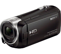
 We used many different technologies within the research planning and evaluation stages. The camera we used was the Sony CX405 Handycam camera to film our trailer as it is has high definition image and high quality sound recording facilities. We believe it is very important to have a high quality camera because the trailer will look high budget and professional.
 When we were filming we found that the camera was very good as it could adjust to some of the lighting, there are certain effects that allow us to make the images stream together seamlessly as the camera adjusts the lighting depending on the time of day. We also used a tripod with some of the shots in order to make sure the shots were steady and professional looking. Last year i did not use a tripod as much and therefore found it hard to create the high budget feel.
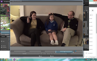
 In terms of the editing format, our group used adobe premiere pro. We were given the opportunity to use the school's computers and the format of adobe premiere elements, however we found the format hard to use and didn't render the footage as fast as we wanted. The editing format that we used allowed us to become very experimental with the footage. We also used transition tools such as the fade to black etc, I allowed us to create a high budget effect for our trailer. On one of the days of editing, we prioritised the titles. We spent hours looking through the fonts and different shadowing effects for the titles. We found the software extremely effective when achieving our titles as there was a wide range of choice and styles.
Some cons of the digital technology during this process were I shot some of the opening images on an iPhone, as I found some establishing shots of the location that I wanted for my film, while walking to school one morning. This therefore meant that the image was slightly different as the cameras have different quality of footage. Another problem we occurred with the compatibility of the camera to the editing software was the difference in lighting, despite remaining in the same location. This was disappointing because despite how precisely i made the cut, the lighting was still disorientated which made it look like we changed location or lighting, affecting the theme of continuity. A skill that I discovered when moving into A2 was the use of transitions of the software we used. As the trailer had to be quick and snappy, we used fades to black to create suspense and also to build tension.
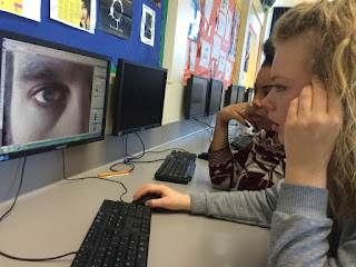
 When making our poster, we spent a lot of time, learning how Photoshop works and how to create a professional look for the poster. We wanted to fade the picture into the back ground by creating a black blur around the picture. One we had found out how to bur the edge with the paint tool, we wanted to change the contrast and colour of the image, this created a darker and more intense look for the cover. This also allowed the poster to look high budget and professional.
We edited the eye by using a brush tools, using the enhancing effect and the lightening tool. We believe it made the eyes look like the main focus and also allow the audience to draw there eyes to the eye. This helped us to create a professional look in the poster and made it look high budget.

No comments:
Post a Comment