Thursday 24 March 2016

Evaluation of all Products


In our magazine poster and our film poster, we have use the same image as the main image on both covers to show that they are advertising the same film. On the film poster, we used a long shot of the image to show the surrounding buildings around her, suggesting that she is alone which is the main story behind our trailer. We had this in black and white and so it contrasts against the image of eyes that we have positioned at the top of the poster. On the other hand we decided to do the image ion the magazine poster to be much more zoomed in and so the audience can focus on her as she is the main character throughout the film trailer. We decided to have this image in colour and fade another image of smoke over the top and so it still fits into the genre of horror but makes it aware to the audience that it is a magazine.This all links in with our film trailer as we have used the same character with the same costume on and so we can show the relevance between all three.
The name titles that we used in our film trailer were very similar to what we have used in our film poster as we think that it is important to keep the names the same to show who is in the trailer and who is involved in creating the final out come. We have presented both the names in the trailer and the poster the same as we would see them in successful media products and so the names that are not the main characters in the trailer are presented together at the end but also in the poster, the names are displayed along the bottom and so it is set out how we would see it on DVD covers. We have used the same font on both the trailer and the film poster and so we can keep it simple but effective for the audience viewing it. When creating the name and the font that we have chosen for our film name, although they are not in the same font as we found that it did not look as effective and professional on both the magazine and the trailer, we did keep the font the same for the trailer and the film as it is clear to the audience that we are advertising the same film product.

Sunday 20 March 2016

Evaluation Task 4

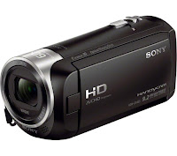
We used many different technologies within the research planning and evaluation stages. The camera we used was the Sony CX405 Handycam camera to film our trailer as it is has high definition image and high quality sound recording facilities. We believe it is very important to have a high quality camera because the trailer will look high budget and professional.
When we were filming we found that the camera was very good as it could adjust to some of the lighting, there are certain effects that allow us to make the images stream together seamlessly as the camera adjusts the lighting depending on the time of day. We also used a tripod with some of the shots in order to make sure the shots were steady and professional looking. Last year i did not use a tripod as much and therefore found it hard to create the high budget feel.


In terms of the editing format, our group used adobe premiere pro. We were given the opportunity to use the school's computers and the format of adobe premiere elements, however we found the format hard to use and didn't render the footage as fast as we wanted. The editing format that we used allowed us to become very experimental with the footage. We also used transition tools such as the fade to black etc, I allowed us to create a high budget effect for our trailer. On one of the days of editing, we prioritised the titles. We spent hours looking through the fonts and different shadowing effects for the titles. We found the software extremely effective when achieving our titles as there was a wide range of choice and styles.


Some cons of the digital technology during this process were I shot some of the opening images on an iPhone, as I found some establishing shots of the location that I wanted for my film, while walking to school one morning. This therefore meant that the image was slightly different as the cameras have different quality of footage. Another problem we occurred with the compatibility of the camera to the editing software was the difference in lighting, despite remaining in the same location. This was disappointing because despite how precisely i made the cut, the lighting was still disorientated which made it look like we changed location or lighting, affecting the theme of continuity. A skill that I discovered when moving into A2 was the use of transitions of the software we used. As the trailer had to be quick and snappy, we used fades to black to create suspense and also to build tension.

When making our poster, we spent a lot of time, learning how Photoshop works and how to create a professional look for the poster. We wanted to fade the picture into the back ground by creating a black blur around the picture. One we had found out how to bur the edge with the paint tool, we wanted to change the contrast and colour of the image, this created a darker and more intense look for the cover. This also allowed the poster to look high budget and professional.


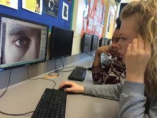
We edited the eye by using a brush tools, using the enhancing effect and the lightening tool. We believe it made the eyes look like the main focus and also allow the audience to draw there eyes to the eye. This helped us to create a professional look in the poster and made it look high budget. 

Evaluation Task 3 - Audience Feedback


From our feedback we found out that our trailer reminded other people of the trailer 'Taken 3' and 'The Lovely Bones'. This is because Lovely Bones does a similar trick to us, where the young victim is shown as innocent in a happy world represented by the bike ride with her family, going to school and having a normal everyday life. However like our trailer this shortly fades when we are introduced to a protagonist and the audience find out the young victim has been murdered. Therefore, it was similar in the juxtaposition of happiness emphasising the sadness. With Taken 3 the comments concluded that the way we used our titles reminded them of this trailer as the titles included key words that involved telling the story. These are successful as it makes it clear to the audience what is going on. As well as this in the last bit it used fast paced editing, like ours, to add a more dramatic effect.

The strengths of our trailer from the feedback involve the camera work. For example, they liked the use of match on action which made the trailer look more professional and that this was successful with the correct trimming of each shot. Another strength involved the non-diegetic and diegetic sound. For example, the non-diegetic sound was layered over the trailer in order to match the timing of the piano making it look like the man was creating the sound. This was effective as the people said that our timing was exact making the trailer look very efficacious. The main aim for our group was to make our trailer dramatic, which horror genres should be. We also incorporated the titles to fit in with the 'bangs' of the sound to make this standout and for our trailer to look more advanced. This added structure to our trailer and was a great success in engaging the audience and adding excitement to 'coming soon'. We were also complimented on our mis-en-scene in the fact the young victim was wearing school clothes representing her vulnerability. As well as this her clothing was blue which connotes sadness, which could add to the sympathy the audience feel for this young girl. This contrasts with the protagonist who is wearing all black clearly showing he is danger.

In the comments there was also constructive criticism which we found was key as it was good to take on board and improve. For example, it was stated that at the end of the trailer the camera should have been focused on the character of the girls face for longer to add emphasis to the enigma of what was going to happen next, giving the audience more time to think about it. Another weakness was the fact that the beginning was quite slow which could possibly mean it takes the audience longer to get into it. Therefore, by making it a bit more upbeat we could engage the audience faster which is successful for a trailer. Finally, due to only having time to film in certain parts of the day we could not adhere to the lighting of the genre in the outside shots. For example, it would be much more eerie if the shots were taken at night time instead of in the day.

Evaluation Task 3 - Discussing our Trailer


Evaluation Task 1

In what ways does your media product use, develop or challenge forms and conventions of real media products?


In the first frame we used a panning shot of the location in the garden. This was effective as it allowed the audience to understand the difference between her lives before and after she grew up, giving in depth prevalence on the young victim allowing the audience to therefore feel sympathy for her. However, as it is a horror the non-diegetic music added over the top created an eerie atmosphere, representing that even though everything does look normal it doesn’t mean it is. Which could create suspense following the conventions of a horror genre. The lighting of the surrounding is quite dim and the autumn season represents cold and darkness. This again is ominous which adds to the genre of our trailer.
This links with the second frame which is a close up of a man’s hand playing the piano. This was used as a special effect as the non-diegetic sound was placed over it and we fitted it within the time scale of his fingers allowing it to be efficacious s and make it look like he was playing this eerie piece. This was a successful prop used as pianos can connote sadness e.g. when played at funerals. Therefore, it allowed our audience to know what emotion to feel and when. These two frames are calming, emphasising the build up to the climax which is effective as the audience would be on the edge of their seat.
The third frame introduces the victim as a young girl. She is portrayed as playful and innocent with a close up of her smiling and laughing around the table. This shows her family to be a neutral and normal middle class family, at this point. Then the fact she is dressed in her school uniform, looking very natural which emphasises her vulnerability and helps create that atmosphere of everyday life. This is effective as it enables the audience to potentially relate to the trailer which could increase popularity.
In the fourth frame we used match on action. This is a skilled shot as is effective due to it being the trailer look more advanced, rather than just following the characters around. Through this process we had to trim each shot to make it look seamless in our trailer. This medium shot is effective as again we see the happy home environment, which soon disappears. The fact that when the young girl sits down in the centre, with both the parent immediately standing up to argue could connote she has no protection or support, again allowing the audience t feel sorry for her. The effect of this is that we can see why in later life she has no contacts to report back to and nowhere to go.
In the fifth frame we are shown a low angle shot of the flat that the young girl has moved into. The effect of having a long shot of this shows the rural area and shows an immediate contrast to where she used to live before. This also helps to create the atmosphere that something is about to happen as the music immediately juxtaposes from calm but tense music to just upbeat music telling the audience something bad is about to happen. The rural area expresses the vulnerability of her as something bad is more likely to happen is a lonely detached house compared the a middle class street.
This then links with the sixth frame, where we see a man, dressed in all black with his hood up. The fact he is wearing black connotes danger and allows the audience to understand clearly that he is the protagonist. Again in this shot we used match on action just to emphasise the protagonist showing him in the shot for longer. This is an effective shot as I begins to tell the story of the trailer. The fact his hood is up and we are never introduced to his face creates mystery and enigmas. I sit somebody in the past? Who is it? This is effective as the enigma will make the audience want to watch the film which is the purpose of the trailer.
In the seventh shot we are actually shown the protagonist and the victim in the same shot. Here the victim letting her hair down ready for the bath, with the door slightly open and the protagonist subtly walking past. This is effective as it creates real tension for the audience. This also represents how easy it is to unknowingly knowing somebody Is in your home, making the audience feel uncomfortable to what will happen next. The girl is shown in high key lighting, still showing her prevalence and the fact that she is harmless compared to the protagonist shown in the dark which connotes evil. Having a male protagonist and a female victim follows the conventions of a genre as this is commonly shown in horrors and men are known to be more dangerous compared to females who are always portrayed as innocent and less powerful.
Then finally as the music increases to its climax and the audience are aware that the protagonist is in the house but don’t know when he is going to attack we are introduced to a medium shot of a hand with a black glove over. The glove is effective as it allows the audience to think what he is going to do to her. Kill her? Kidnap her? It also adds to the mystery of the protagonist. The fact he has grabbed her at the most unaware time (her reaching in for clothing) allows the audience to jump as they did not expect that it was going to happen then compared to the other times where there was an easy possibility. This is effective as it makes our trailer unpredictable which many people enjoy in the horror genre.
Finally our last frame which is the ninth is our title. The fact of having our title at the very end means the audience have to watch the whole trailer to see what it is called. As well as this the audience are more likely to remember the name of the trailer compared to if it was introduced at the beginning, before understanding the story. This is effective as it could increase our viewers when it is released. Although modern trailers follow the conventions of white writing on a black background, we decided to use silver which had a gradient allowing it to be lighter at the bottom. This is effective as it made the final product look sharper and the white at the bottom adds a glow making it look eye catching, as it still stands out from the black background. The text we used was Felix Titling as it was really bold which we wanted top again make it stand out. The title was coped and rotated upside down and then faded. This was successful as it created a shadowed look which made our trailer look more skilled but also was different compared to just having it in the centre of the screen alone.

Wednesday 16 March 2016

Using Conventions from Real Media Texts

In what ways have your productions used or developed conventions from real media products?

In my AS production certain aspects of our opening two minutes conformed to the conventions of a Horror. Horror conventions consist of: young teenagers, male villain, low key lighting and surrounding such as woods, haunted houses and deserted streets. In our AS we tried to adhere to as many of these as possible however, due to a tight schedule it resulted to our group only being able to film during the day therefore we did not have the low key lighting. This isn’t efficient as it makes the opening two minutes much less eerie and would frighten the audience less. Low key lighting usually provides a dark and gloomy atmosphere which is key in making the audience feel afraid and tense. However, our group did conform to certain aspects such as the male villain. The reason we chose to have a male villain is because this gender is portrayed as more powerful and dangerous in society. For example in movies such as Taken and The Call. These films as well as our opening two minutes also replica the young girl victim. This is because females are portrayed as vulnerable in society therefore by having her in her school uniform, walking alone in the woods (very stereotypical) tells the audience that something bad is about to happen, creating suspense. Another convention we followed was the use of extreme close ups. This was successful as it created a clear picture to have each character was feeling, allowing the audience to feel the same emotion and relate to certain characters. This overall can have a positive effect on our opening two minutes as we want it to be as believable as possible. We also could have adhered to the conventions further by having the victim ether kidnapped/murdered as our opening two minutes was left on an enigma to whether she got away or not.

During this process Pierre Morel (the director of the three taken films) was a massive influence on our production as he was our most researched director and we shared the most similarities based on storyline and conventions, apart from his movies containing a more action approach. I liked his approach when using titles, the style of this and how this has an effect on the audience. For example, the titles were displayed in areas that would create suspense for the audience. For example, they aren’t applied in the fast paced editing as this could become a distraction but are used in the centre/end where people are more likely to remember what is said and have a clear understanding of what the movie is going to be about. As well as this the director uses many fades to black which we incorporated in our A2 trailer. We found this was very successful as it was a gradual way to change shots, allowing us to have fast paced editing, creating a dramatic effect for the audience.
Another director that was quite influential in our opening two minutes was Brad Anderson (director of The Call) which used many close ups to cut between the conversations of the characters. I found this effective as like we did in our opening two minutes it allows the audience to be able to see the emotion and facial expression of these characters. For example, in The Call trailer you can see the frightened girl who the audience feel sympathy for, and the ambulance woman who is determined to save her. This empowers the audience and shows what the film is going to be about.

I have developed these skills at A2 by changing the scenery for our trailer. For example, we used a rundown area that was deserted. This is effective as it immediately allowed an ominous atmosphere, making the audience feel uncomfortable. This is a major convention of a horror genre as like I said it provides the atmosphere affecting how the audience feel. This setting was successful as it allowed us to incorporate low key lighting. For example in the house we could dim the lights for it to adhere to a horror genre more. In our A2 production we still used a male villain and young female victim. However, in this trailer we saw the victim grow up following the prevalence of her life. Seeing her happy at such a young age allows the audience to grow a closer connection with this character therefore when she does grow into a teenager the audience feel the need to protect her. In our AS production to costume of the male villain was not effective as we both went to the location straight from school therefore it was just his school clothes. This year we thought about the costumes much more, being well equipped with black gloves and black clothing. This is effective as black connotes danger. As well as this the gloves created mystery but also made the trailer creepier by the fact he was skilled at this job.

Tuesday 15 March 2016

Post-production

From the audience feedback for our opening two minutes I specifically learnt that our group should have developed further with the shot of the pink bag being on the floor, as we created it to be quite a large aspect but did not act upon this. However, it was as noted that we created the build-up successfully by cutting between two shots of the victims and protagonist’s feet allowing the audience to feel tension. For our editing the review was overall that it was really good, apart from one jump cut. This is effective to know as if we made this mistake in our trailer it could have allowed it to look less professional therefore we took extra time. It was also said that it would be much more effective if the music was louder on certain bits where the climax has reached, which we all agreed with. Therefore after this I used the editing tool clipping and we trimmed between the shots where the jump cut had occurred; this allowed it to then become seamless and look professional. As well as this we looked in further detail of the music and actually found out how to make certain areas of the clip louder by using the editing tool volume. This was successful as it did make our opening two minutes feel much tenser. The post production process enhanced the whole production as like I said it made it look seamless, allowed us to pick up on little areas that we couldn’t notice because we have watched it over and over again but somebody who has never seen It can spot these aspects, allowing it to be the best it can and provide the highest quality for the audience.

I have developed these skills at A2 quite simply. For example, this involved being aware of the time. For example, in AS we assumed that it would only take one day of filming. However, this was not the case as when we looked over it we found out that we had to re film certain bits due to the light affecting to shots, etc. This year we gave ourselves 4 days to film over, allowing us to make as many changes as we wanted. This is effective as the more footage we had the better as we could also get rid of the bad shots but was good to have the options for the good shots and which ones we wanted to incorporate. This also allowed us more time to play around with sound, makings sure that it created the right emotion at the correct time, which is such an important aspect of a trailer. This was similar to the shots where we made sure the cuts were seamless. We simply did this by being more careful and thorough.

Sunday 13 March 2016

Research and planning

As a group before making our film we decided to make the target audience 15-24. We chose this specific audience as when doing research on a few horror movies we looked up what age category was mostly likely to watch that horror movie and these were the most popular ages. This will then enable our film to be more popular with a wide range audience that appeal to horrors. This type of audience may be popular as we know young teenage boys and girls are most likely to go in groups and watch a horror movie as they love the adrenaline of being frightened. Our audience enjoy horrors that contain a lot of suspense which we tried to succeed in our opening two minutes with the build-up and eerie music trying to create as much spook and tension as possible.

We recorded our research on our blogspots; we did this by making a questionnaire to ask the people within the age group their favourite aspects of horrors. This allowed us to use quantitative data to calculate the statistics of each question, increasing reliability but using some open questions where they had to explain their reasoning which also allowed us to use qualitative data where we could analyse and understand a deeper meaning into why this aspect of a horror means so much to them.

This research is effective as it allowed us as a group to create an opening two minutes that suits the needs of the particular demographic as we used random sampling, allowing us to get a cross section of the population, increasing representativeness for this audience and generalisability resulting increasing popularity for our opening two minutes.

In our storyboard we did follow the general pattern and idea of it however, when we got to the location our minds had come up with more ideas within where we could place shots in certain areas therefore we did go off track. However, it still provided us with a frame of what we were going to do when we arrived so it was still effective. With the shots we pretty much followed the codes and conventions of horrors and used a range of close ups, medium shots and long shots which we knew could all create suspense and tension therefore this was straight forward and made our opening two minutes look so much more effective and professional. Our opening two minutes didn’t contain much script at all, as we used the diegetic and non-diegetic sounds to create the ere ad ominous atmosphere that we wanted to appear. For example, the non-diegetic sound consisted of the victim screaming, the rush of the chase and the slow build up creating tension where it is completely silent, and then a stick snaps connoting the fact that she is officially in danger. The non-diegetic sound used was Evening on Chaos where we trimmed and extended certain bits to create a build up from her unaware of a follower, to the two shot where we finally see the protagonist, reaching the climax and music becoming louder and faster during the embrace of the chase.

However, our group has further developed these skills at A2 where we could show off more skills through creating our own magazine cover and poster to advertise and sell our movie. Therefore we had to dive into deeper research, using a range of questionnaires and surveys, ensuring they are much more detailed and will provide more effective results compared to last year. For example, in AS they were mostly closed questions with only around four choices therefore it did not cover all aspects of a horror genre. This year each we added the choice of ‘other’ and if this box was chosen there would be an opportunity for the participant to explain what and why. This was effective as it allowed our trailer to keep up with what the demographic enjoyed to see in horrors now days as this could have possibly changed from a year ago. As well as this, with our storyboard we wanted it to be more specific so we had something to strictly follow instead of partly improvising like we did last year. We achieved this by adding many more images to the animatic storyboard, allowing it to be more detailed and provide an accurate video of what our trailer would look like. Therefore when coming to our filming it was less time consuming allowing us to meet deadlines. With the shots last year, our criticisms was that we did not have that many close ups therefore this year we did incorporate a range of extreme close ups and then close ups on the victims face and certain surroundings such as the window of the abandoned house. This was effective as it created the atmosphere that somebody was there, watching her, creating suspense.

Creativity

Due to this being our first creative activity, our opening two minute followed a conventional storyline of a young victim, being followed by the protagonist unaware. However, we did use techniques to add a unique selling point on our opening two minutes. For example, she was kidnapped in day light, walking home from school after just talking to her friends. This showed to the audience that this could potentially happen to anyone and emphasises the victim’s vulnerability as the young girl had just finished school. Whereas it other films were conventional with a dark alley in the middle of the night mostly when the victim is intoxicated after attending a party. This therefore allowed the audience to put themselves in the characters shows feeling sympathy for her. Therefore, we did include twists to our opening two minutes but the disadvantages of it is that it wasn’t a new rejuvenated film that nobody had ever seen before.

Due to the main task of our blogposts, which was to research and analyse opening two minutes in depth, from the beginning we knew we thrived to do a horror. Therefore, starting straight away we analysed this genre more than the others, so our group could get a deeper understanding into the conventions of horrors; what each opening two minutes could provide for the audience. This was successful as we could understand the type of clothing the victim would be wearing, compared to the protagonist, where music was used to build suspense and tension, and the types of shots horrors used to create that eerie atmosphere that got their audience on the edge of their seat. For example, close up shots to represent their emotion and high angle shots making the characters seem vulnerable. This allowed each person in our group to take notes on what they thought was the most important aspect of a horror genre, and at the end we put the notes together and then stated to incorporate this into an opening two minutes, which we found was extremely successful.

Adobe Premier Elements allowed us to add features which could make our opening two minutes look more skilled. For example, sound is a key feature in an opening two minutes. If there was no sound the audience would be unaware of what emption to feel at what time. Therefore, we researched un-copyright music and got listed a different soundtracks that suited our genre. This is because we got asked what feels we wanted to see in our soundtrack where we chose: Mysterious, Suspenseful, and Eerie. Adobe allowed us to add in these soundtracks wherever we wanted to in our opening two minutes, clipping and extending them to fit into the piece. This was efficacious as it allowed us to create a climax for the audience, letting them know something was about to come, successfully following the conventions of the genre to frighten to audience; create adrenaline. It also allowed us to include titles which again is needed, so the audience know the title of the film. After watching YouTube tutorials, which was a great hep to us as we were new to Adobe, we got a much better understanding of not only how to use it but what more it has to offer. The first thing I learnt whilst watching the clip is the three different types of titles that were ranging from default still, default roll and default crawl. After giving definitions of them all it helped me decide which one I wanted to choose when editing my film. After this I then learnt how to change the font, size and spacing of the title to make the piece more appealing and appropriate for your type of genre. Here I would use the font I have chosen which is Felix Titling as our group found that it was most successful with the genre. I then learnt how to place this title onto the chosen background getting the final look of our title. I also learnt about a variety of transitions such as: cross dissolve, centre split, cube spin, flip over and many more. After this I then learnt how to apply this by taking your clips and trimming off each one allowing the transition to be smoothly cut. The next step would be to pick your chosen transition and place it in the centre where these two clips meet, then adjusting the transitions lengths to suit your film and that is the final of how to add transitions successfully. This would allow the audience to benefit from a high quality piece, where the shots seamlessly cut from one to the next allowing jump starts to be avoided which could make the opening two minutes look amateur.

By researching other opening two minutes we found that close ups were used on the victim to show her vulnerably and her facial expressions of fear, clearly allowing the audience to sympathise with her. As well as this high angle shots were used to take the power away from her again emphasising how alone she is.

Last year we quickly adapted to Adobe and lots of research on watching YouTube tutorials allowed us to understand what we need to do. However, this year titles were much more crucial as it was a trailer. Therefore, we developed much more into one piece which was more challenging. For example, we were able to sell the trailer and increase popularity of the trailer over a global scale by including hashtags, which is very effective in this society as social media is such a large distribution in everyone’s life and it is free, therefore is a successful way to advertise a trailer. As well as this we were able to explore in more detail of what Adobe had to offer by us having to make our own production titles. We browsed our own photos for the production titles, put this into a document on Adobe and incorporated the effects: Glow soft, Additive Dissolve, and Fade in and out of black making them look practised.

Digital Technology

How did you use media technologies in the construction and research, planning and evaluation stages?

The technology we used for making our opening two minutes was Adobe Premier Elements on PC. With this we could do a variety of editing to make our opening two minutes look more professional as we were able to trim and cut shots down which provided seamless shots. This is efficacious as it allows the audience to benefit from the good quality as if it had increasingly noticeable jump cuts this would make the audience less intrigued to watch our film as it would look low budget. Adding transitions such as additive dissolve made links with the cutting and again allowed our opening two minutes to look more advanced. We also used the fade in and out transition with the credits as it again made the opening two minutes seamless. As well as this we could add soundtracks in which we edited to fit the film helping us to create the build-up and reach the climax at the right time, creating an eerie atmosphere. When creating the titles it allowed us to follow the codes and conventions of a horror as we could choose background colour, a type of font, and the font colour. Overall, this helped adapt our film to its final product, looking experienced and polished. However, the disadvantages of using this are that we found it reasonably difficult at first so it was very time consuming and hard to get to grips with. This meant we couldn’t do as much editing as planned which could have affected our final product.

We used a Canon 1200D camera. This came to an advantage to us when filming as it had high standard quality. However, the camera was quite large and heavy therefore it was harder to transport to different locations of filming. The camera had manual focus, which allowed us to change the depth of field, blurring the background and have a sharp focus on our chosen characters and surroundings. This could have provided tension and suspense at certain points of the scene. With the camera we used a variety of shots such as match on action, low shots, and high shots to tell the audience who was vulnerable in our trailer, taking away the power from the young girl victim. However when doing hand held shots which we used in our opening two minutes it was much more shaky than expected due to the camera being large which made our opening two minutes look less advanced.

I have developed these skills at A2 by using the Sony CX 405 Handycam. This camera was lighter and therefore more efficient as the camera could be easily transported to different locations. As well as this some of the shots were quite spontaneous. For example, if we went on a day trip it was easy to take a few shots of the location to add to our trailer, for example, when we were in London. This is efficacious as it makes our trailer look high budget which would result in a wider audience watching our film. This year we used a tripod regularly in our shots to create a steady film as last year we mainly filmed using our hands which made our opening two minutes look less polished. Last year our filming was taken all outside, therefore we were dependent on the time to affect our lighting. This was not successful as we couldn’t use the lighting to create an ominous atmosphere. This was different in A2 as we filmed inside therefore we could change the lighting to affect our trailer. For example, in the eerie scenes the lighting was more dimmed; we could place lamps in certain areas in the room to put more light onto the main characters, implying to the audience which characters had the most prevalence. We researched this by watching the trailer of Taken 3 where throughout it is set in two houses and the effect of the lighting used to create suspense and tension. This year we used Premier Pro instead of adobe elements which is a much more updated and advanced version. This was a huge advantage as it has updated tools and much more high tech which ended up making our trailer look more advanced as we could incorporate new things such as transitions, more texts and fonts which would fit the conventions of our genre.

Friday 4 March 2016

How our media product represents a particular social group

How does your media product represent particular social group?

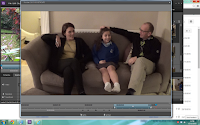
This is our character who plays the sympathetic victim, Serafina, She appears very innocent and childish with her school uniform. As she is the victim of the danger within the family the audience feel empathy for her and therefore dislike the parents. by having a young child as the victim at the beginning, helps the audience understand her paranoia when she grows up and therefore allows the audience to understand her like from beginning to end.By showing the journey of her life and the obstacles she has to overcome, the audience feel a greater connection to her and therefore can feel more empathy when things go wrong. we decided to show her laughing along with her family to show that she is a very sweet girl who has a very innocent personality and then juxtapose it with the scenes of her parents arguing and telling her to go away. We thought we would keep her in her school uniform as it created an element of normality from the audience and they would feel the connection from when they were younger.

This is the young girl from the lovely bones; she plays the victim in a kidnapping. We believe our character follows the same conventions as this girl as they are very innocent looking and are separate to the rest of society. Our character isn't blonde like this one, often the blondness connotes innocents and angelic nature however, Serafina is very young and beautiful and therefore gives the same effect. In the lovely bones, she has parents that often argue and cause he to get very upset, this follows a similar sequence to our film as we thought it had a good impact on the audience.

Wednesday 2 March 2016

Audience

Who would be the audience for your media product?


Due to our film having an age certificate of 15, this set us a good idea that our target audience would range for the 15 to younger adults such as 22. After doing research of the demographics for the majority of horror movies we found that this age category was the most appropriate for our trailer. This is successful as allowing our target audience to be 15 allows a wider range which could potentially increase profits. The typical ratio to watch our trailer would mainly be girls, this could be represented in the female cast, relating about a troubled girl. Therefore,many females could relate to this character and find this as a coping mechanism to escape from their own lives. Although, the percentage of males watching horror movies can still represent huge interest in this genre, but this could just be because males and females are more likely to attend a date to the cinema to watch a movie, stereotypically for the female to cuddle up to the boy. As we found out from our survey our target audience enjoy horrors that create a mystery as their favourite TV programme Sherlock Holmes, we uncovered the meaning of this and it was proven they found the mystery in the programme engaging, getting them excited to watch next weeks episode. Our target audience listen to quite a lot of pop music, in the charts, to keep up with the trends in day to day society.This allows them to have something in common and mingle as a friendship group providing a topic for conversation. We tried to create this mysterious effect in our trailer by having a secretive villain out to get this young girl, where hes face in never exposed throughout the whole trailer, only as man with a black figure. This young age category tend to shop again in the most trendy places such as River Island, Misguided, Topman where it allows them to go out and interact and enables them to become a fashionable idol whether it is only in the environment of school or work. 

Elle Film Trailer